Who knew the process of publishing a book was so involved? When I started this dream, I thought, “Hmmm, I’ll just write and put it out there.” Wow, was that ever wrong! There’s writing, revising, editing, sending it to beta readers and an editor…and that’s just the book. Then there’s the website, social media, and book covers. Whew, it can be exhausting.
Now, there are several sites out there that offer pre-made book covers, and some of them are pretty good. But I happened to have a friend who is a really talented photographer and graphic artist. I can describe to him exactly what I have in mind and he makes it 100% better than I could have imagined. And then there are the times he just creates a masterpiece from his own thoughts.

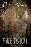
 Free to Kill in the Katie Freeman series was the first book I completed and published. It was also the first time I had to actually think of what to do for a cover. Michelle (my social media guru), Ryan and I sat down to begin brainstorming. I gave them a pretty in depth description of the book and what I had in mind. Ryan asked what the church I envisioned looked like, so I started searching online. I found a church in a small town in Kentucky that was PERFECT! But who had the time or money to go to Kentucky? So I started looking for similar architecture in Tennessee. I found the church on the cover of Free to Kill in downtown Nashville – and BONUS! it even had the red door!! The only problem was that it was on a weird street corner with traffic all around and electrical wires obscuring every view. But Ryan took his camera and somehow made the church look like it was in the rural setting from the story. It was the first time I realized what a master he was behind the lens.
From that time on, we have worked to build a theme between the books in a series. This was something I didn’t really think about in the beginning. Take a second to go look at the covers of your favorite book series. Do you see a similarity? That’s called Branding – and it’s vitally important. Who knew!?
With this information, Katie Freeman covers had a color scheme and a main attraction – that was always red. In Free to Kill, it was the door. In Free to Deceive, it was the fountain. In Free to Live, it was the front door of the house (Ryan actually had this cover designed before I published book 2, but it was so perfect for book 3, that we held off on using it). I can’t wait to see what it is in Free to Believe – book four (no release date yet, but shooting for June…).
The same theory applied to the Devil Mountain Shifters books that I released in October. They all had the same mountains in the background and the same physical look.
The Tip of the Spear series was a little trickier. I said from the beginning that I wanted the large spear on the cover with the main image in the center. Ryan still argues with me to change that, and one day I might let him win. But changing that now would mean redoing all the covers so that they are consistent. I think both he and I struggle more with the Tip covers than any other. He sends me beautiful first drafts that would be sufficient if I used them. But there’s just something that doesn’t hit right. He’s become a mind reader when I say “there’s just something not right about it.” One thing I’ve learned is to actually tell him when something doesn’t sit right. That’s a difficult thing to do for a person who hates to make waves. I’m one of those people who will never send food back in a restaurant, just because I don’t want to upset anyone. I’ve had to adjust that mentality for my books. After all, these are my babies. If I don’t speak up for them, who will?

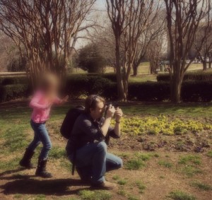
Goofing around during the photo shoot for the In The Wind cover.

Ryan Bukowski, my cover artist and photographer


